Home
Templates
Design Systems
Use Cases
Contact
Back to design aesthetics
Share
Save
White Tile Café Noticeboard
/whiteTileCafNoticeboard
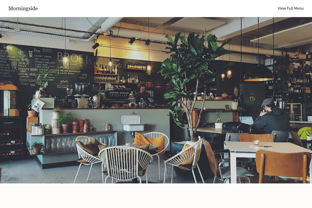
Design philosophy: create a café page that feels like a careful local noticeboard translated into a refined web layout. Core beliefs: warmth comes from plain language, real photography, and readable type; hierarchy should come from spacing, headline scale, and thin dividers. Strict rules: light white navbar, full-width 80vh hero image, calm serif headline, one bottle-green CTA, one text menu link, centered introduction, a menu section like a printed counter list, and a practical location block. Typography philosophy: use Charter, Georgia Pro, or Lyon Text for headings with FF Real, Freight Sans, or Source Sans 3 for UI. Palette: warm white, tile gray, graphite, bottle green, muted cherry accent. Spacing: simple, consistent, slightly old-web generous. Motion: basic fades only. Imagery: counter, pastries, handwritten board details, street frontage. Refuses badges, icons, gradients, review clutter. Mediocre implementation: generic café template. Common mistakes: too much green, fake chalkboard styling, cramped menu rows.
0 likes
0 bookmarks
Aug 20, 2026
Copy Design Aesthetic