Home
Templates
Design Systems
Use Cases
Contact
Back to design systems
Share
Save
Studio Aurora
/studioAurora
A beautifully crafted landing page template ready for your next project.
1 like
Jul 5, 2026
Copy Design System
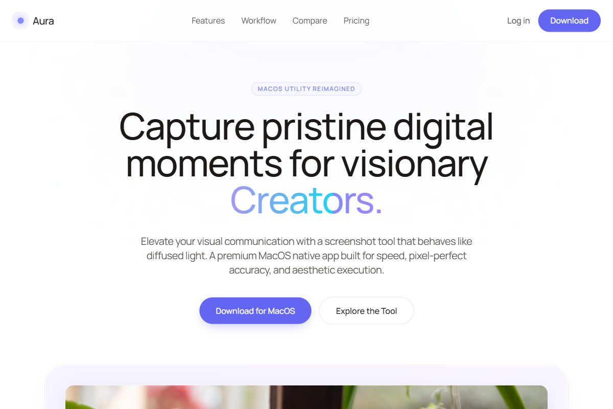
Live Preview
Design System Content
# Studio Aurora Design System A design language for fast-moving founders who require pure polish, elevated by ethereal, ambient lighting and subtle iridescence. --- ## Philosophy > "Polish without noise. Restraint illuminated." This system creates interfaces that feel like a high-end photography studio bathed in soft, shifting light. Digital products are staged inside pristine, atmospheric environments. Designed for builders who need high conversion and aspirational trust, this aesthetic relies on generous whitespace, softly shimmering product framing, and predictable structures ending in a mesmerizing, deep-space conversion point. ### Core Beliefs 1. **Gradients are Light Sources** — Aurora gradients (`indigo`, `fuchsia`, `cyan`) are never used as flat paint. They exist as deeply diffused background drifts, subtle text shimmers, or interactive hover states that act like light bleeding through frosted glass. 2. **Scannability is Survival** — Founders have seconds to pitch. The structure must remain utterly predictable: centered heroes, compact logo rows, alternating features, and crisp FAQs. 3. **Foundation of Light** — Deep white and soft stone canvases act as the seamless backdrop, allowing the iridescent accents to breathe without overwhelming the user. 4. **Medium Weight, Maximum Readability** — Headings step back from aggressive bolding, utilizing balanced, medium weights that feel modern, competent, and unforced. 5. **The Deep Aurora Anchor** — The journey ends not in a flat black box, but in a striking, deep-hued aurora gradient band that acts as an undeniable visual anchor. ### Strict Rules * **No Saturated Flat Backgrounds** — Brand colors are only permitted as text gradients, 1px iridescent rings, or ultra-low opacity (`10-20%`) background tints. * **No Raw Screenshots** — Every piece of product imagery must be housed within a "Product Stage" component featuring an ambient aurora drift. * **No Bouncy Motion** — Animations are limited to understated fade-ups, subtle lifts, and slow, 15-second environmental gradient drifts. * **No Heavy Shadows** — Depth is created via delicate inner white highlights and tinted, highly diffused shadows (e.g., `shadow-indigo-500/5`). * **No Generic Typography** — Standard system fonts are replaced by highly crafted modern sans-serifs (like Manrope). --- ## Color Palette ### Foundation & Staging Scale The palette preserves the crisp white base warmed by ultra-subtle stone tones, but introduces a tri-color "Aurora" scale for staging and a deep, cosmic slate for high-contrast action bands. ```css /* Core Canvas (The Studio) */ bg-white /* Primary application background (#ffffff) */ bg-stone-50 /* Soft stone for alternating layout blocks (#fafaf9) */ /* The Aurora Light (Accents & Staging) */ from-indigo-400 via-fuchsia-400 to-cyan-400 /* The core text shimmer gradient */ from-indigo-50 via-purple-50 to-cyan-50 /* Ultra-light ambient stage drift */ bg-indigo-50 text-indigo-500 /* Group-hover interactive states */ /* Borders & Highlights (The Studio Lighting) */ border-stone-200/60 /* Structural dividers, FAQ borders */ ring-white/80 /* Delicate inner highlight for studio objects */ ring-indigo-500/20 /* Barely-there outer iridescent bounds for components */ /* Text Hierarchy */ text-stone-900 /* Primary text, hero headings, active tabs */ text-stone-600 /* Body copy, subheadings, testimonial quotes */ text-stone-400 /* Placeholder text, metadata, compact logo rows */ /* The Anchor (Deep Aurora CTA Band) */ bg-slate-950 /* Deep slate base */ from-slate-900 via-indigo-950 to-purple-950 /* The terminal gradient drift */ text-white /* Bright text against the high-contrast band */ ``` --- ## Typography The typographic scale continues to use beautifully crafted, modern sans-serifs—such as **Manrope**, **General Sans**, or **Inter Tight**. Headings remain strictly medium-weight, paired with tight, highly readable Inter or Lexend Deca body copy. Pair Lexend Deca headline with Manrope body and adjust weights to suit the chosen fonts accordingly. ### Font Weights ```css font-medium /* ALL Headings (H1-H6), primary button text - MANDATORY */ font-normal /* Tight body copy, testimonial content, descriptions */ font-semibold /* Small metadata tags only, compact logo labels */ /* font-bold and font-black are strictly forbidden to maintain minimal elegance */ ``` ### Font Size Scale ```css text-xs /* Compact metadata, overline text (12px) */ text-sm /* Standard interactive elements, tight FAQ bodies (14px) */ text-base /* Core readable body copy, feature descriptions (16px) */ text-lg /* Testimonial quotes, emphasized lead paragraphs (18px) */ text-xl /* Card titles, minor feature headers (20px) */ text-3xl /* Standard alternating feature section headers */ text-5xl-7xl /* Centered Hero titles (responsive scale) */ ``` ### Letter Spacing & Transforms ```css tracking-tight /* Standard for all body text to ensure tight, readable blocks */ tracking-tighter /* Hero headings to create a modern, locked-up visual block */ tracking-wide /* Eyebrow tags, section overlines */ uppercase /* Solely for section overlines and tiny tags */ ``` ### Hierarchy Examples | Element | Size | Weight | Color | Tracking | Transform | | --- | --- | --- | --- | --- | --- | | Hero Target Word | 6xl-7xl | medium | transparent (gradient) | tighter | none | | Centered Hero | 6xl-7xl | medium | stone-900 | tighter | none | | Section Eyebrow | xs | semibold | indigo-400 | wide | uppercase | | Alt Feature Body | base | normal | stone-600 | tight | none | | High-Contrast CTA | 5xl | medium | white | tighter | none | --- ## Animation System ### Core Philosophy: Ambient Polish Motion exists to gently guide focus and mimic physical light. Transitions emulate slow-moving studio reflections and subtle physical elevation. ### Ambient Keyframes (Mandatory) ```css /* Background Drift (applied to Product Stages and Deep Anchor) */ @keyframes drift { 0% { background-position: 0% 0%; } 50% { background-position: 100% 100%; } 100% { background-position: 0% 0%; } } /* Shimmering Text Target (applied to the hero focus word) */ @keyframes textShine { 0% { background-position: 0% center; } 100% { background-position: 200% center; } } ``` ### Page Transitions (The Fade-Up) ```tsx initial={{ opacity: 0, y: 16 }} animate={{ opacity: 1, y: 0 }} transition={{ duration: 0.6, ease: [0.16, 1, 0.3, 1] }} ``` ### Micro-Interactions (Iridescent Card Reveal) When interacting with bento features, a soft colored glow is revealed alongside a slight icon color change. ```tsx // Corresponds with CSS: group-hover:opacity-100 on absolute colored background overlays whileHover={{ scale: 1.02 }} transition={{ duration: 0.3, ease: "easeOut" }} ``` --- ## Layout Architecture The system demands a highly scannable, structurally strict page flow: 1. **Centered Hero:** Massive whitespace, `text-7xl` medium heading with one shimmering target word, clear primary/secondary button pair. 2. **Compact Logo Row:** Grayscale or iridescent hover states, tight spacing, opacity 60%. 3. **Alternating Feature Sections:** Left-text/right-stage, right-text/left-stage. High margin (`py-24`). 4. **Testimonial Cards:** Multi-column masonry or simple horizontal scroll, visually separated by floating card lifts. 5. **FAQ Rows:** Clean accordion lines (`border-b border-stone-200`), expanding with a slight fade. 6. **Deep Aurora CTA Band:** The final visual anchor. `bg-slate-950` block with a slow `drift` animation spanning full width to trap attention before the footer. --- ## UI Components ### The Aurora Product Stage The signature component. Treats application screenshots like high-end hardware bathed in ambient light. Features a slow-drifting backplate, an inner white lighting highlight, and a slightly tinted, diffused shadow. ```tsx <div className="relative p-8 md:p-12 rounded-[2.5rem] bg-gradient-to-br from-indigo-50 via-purple-50 to-cyan-50 studio-drift ring-1 ring-stone-900/5 overflow-hidden shadow-[0_12px_40px_-10px_rgb(99,102,241,0.05)]"> {/* Studio inner highlight */} <div className="absolute inset-0 rounded-[2.5rem] ring-1 ring-inset ring-white/80 pointer-events-none z-10" /> {/* The Object (Screenshot) */} <img src="app-ui.webp" className="relative z-0 rounded-2xl shadow-[0_8px_30px_rgb(0,0,0,0.06)] ring-1 ring-white/50" alt="Product Interface" /> </div> ``` ### Deep Aurora CTA Band The terminal point of the landing page. Inverts the palette and introduces the deep space gradient to demand action. ```tsx <div className="w-full bg-slate-950 bg-gradient-to-br from-slate-900 via-indigo-950 to-purple-950 studio-drift rounded-[2rem] py-20 px-8 text-center flex flex-col items-center relative overflow-hidden"> {/* Inner Glow */} <div className="absolute inset-0 rounded-[2rem] ring-1 ring-inset ring-white/10 pointer-events-none" /> <h2 className="text-4xl font-medium tracking-tighter text-white mb-4 relative z-10"> Ready to build? </h2> <button className="bg-white text-indigo-950 font-medium px-6 py-3 rounded-lg hover:scale-[1.02] transition-transform shadow-[0_0_40px_rgba(255,255,255,0.15)] relative z-10"> Start your free trial </button> </div> ``` --- ## Component Catalog ### Iridescent Bento Grid Cards White cards that reveal a soft aurora hue upon hover. ```tsx <div className="w-16 h-16 rounded-2xl bg-white ring-1 ring-stone-900/5 relative flex items-center justify-center group"> <div className="absolute inset-0 rounded-2xl bg-indigo-50 opacity-0 group-hover:opacity-100 transition-opacity duration-300" /> <div className="absolute inset-0 rounded-2xl ring-1 ring-inset ring-white/80 pointer-events-none z-10" /> <span className="relative z-10 text-stone-700 group-hover:text-indigo-500 transition-colors duration-300"> ⌘ </span> </div> ``` ### Buttons ```tsx // Primary Button "bg-stone-900 text-white font-medium tracking-tight text-sm rounded-lg px-5 py-2.5 hover:bg-stone-800 transition-colors shadow-sm" // Secondary Button (Aurora Accent) "bg-white text-stone-900 font-medium tracking-tight text-sm rounded-lg px-5 py-2.5 ring-1 ring-inset ring-stone-200 hover:bg-stone-50 hover:text-indigo-600 transition-colors" ``` ### FAQ Accordion Row ```tsx // Interactive Row "flex justify-between items-center w-full py-5 border-b border-stone-200/60 text-left hover:text-indigo-500 transition-colors" // Question Text "text-base font-medium tracking-tight text-stone-900" ``` --- ## Quality Checklist * [ ] Is the shimmering target text (`animate-textShine`) restricted to a single focal word or phrase to avoid visual overwhelm? * [ ] Are all product screenshots housed inside a rounded **Product Stage** with the `studio-drift` aurora background? * [ ] Are all headings strictly set to `font-medium` (no bold or heavy weights)? * [ ] Do interactive elements (like bento icons) utilize `group-hover` to reveal subtle colored backgrounds instead of harsh changes? * [ ] Are drop shadows tinted slightly (e.g., `rgb(99,102,241,0.05)`) to match the ambient lighting? * [ ] Does the final call-to-action sit in an inverted, deep aurora (`via-indigo-950`) band with a drift animation? --- ## Allowed vs Not Allowed ### ✓ Allowed * Bright white and soft stone canvases. * Translucent text gradients using the `indigo`, `fuchsia`, and `cyan` tailwind scale. * Slow-moving (`15s+`) background ambient animations. * Colored drop shadows with extreme blur and low opacity (`4-5%`). * Delicate inner highlights (`ring-inset ring-white/80`). * Massive, generous padding between page sections (`py-24` or `py-32`). ### ✗ Not Allowed * Solid, fully opaque bright colors as backgrounds (e.g., no `bg-indigo-500` except for primary buttons). * Bold, Heavy, or Black font weights. * Bouncy, elastic spring animations. * Raw, edge-to-edge screenshots without a staging backplate. * Multiple text elements using the shimmering gradient on the same page. * Heavy, dark drop-shadows on white cards (this breaks the ethereal lighting aesthetic).
Preview